Design.2 - Demystifying UX/UI Design Pt.1
The past and present of a design field from the future.
Course Syllabus
2. Introduction
Aurora wakes up completely out of oxygen, her helmet’s vital systems indicator beeps violently in her ear, and she can’t understand what’s going on or how she got there. She just knows that she feels cold, very cold. As soon as her vision clears she can see that she floats in the most complete galactic void where no matter which direction she looks, she visualizes a magical mixture of dark color tones. For a moment, she is fascinated by nebulae of all colors decorated by millions of stars that twinkle light years away.
Her breathing starts to get heavier and heavier and she begins to fear for her life, despair kicks in and she starts mapping her own body until she finds a button in her spacesuit right at the bottom of her neck. She starts to wonder if she should really press it, remembers the countless science-fiction movies she’s seen, and realizes that losing her helmet would be the first and last step to failing as an astronaut. The cold begins to permeate her entire body and she realizes that her suit’s temperature system also critically fails. With no other solution, she decides to press the button and immediately, an interactive holographic screen glows on her wrist, her spacesuit’s interface had been initiated and now she could configure the systems that were failing.
A long list of on-screen alerts emphasized how bad of an astronaut she was and had let it all get out of hand, but feeling hopeful, she started scrolling through the options until she found a button that said “suit assistant.” without thinking twice, she started the module.
— Hello, Aurora.
Mayday, mayday!
What kind of sane mind would put a button to initiate a wrist graphic interface on the neck of a suit?
Well, I did.
For the whole sake of making use of my poetic license.
Gladly, for Aurora, it was the right button.
Nothing made more sense than starting this issue with that excerpt from my fiction book.
Because UX/UI designers always know where a button should go.
Precisely because UX stands for “User Experience” and UI for “User Interface”.
But there is absolutely nothing intuitive about putting a button so far away from the actual device that it interacts with.
It would be like putting a “Start Engine” button in the back seat of a car.
This bizarre astronaut’s user experience problem kickstarts our first issue about UX/UI.
Fairly because nobody is really wearing a spacesuit nowadays, but there are digital devices all around us.
And the more screens there are, the more UX/UI designers we will need.
Someone blow all the horns! This is a duty call.
No, I’m not talking about the shooting game.
I’m talking about today’s most demanded (and maybe demanding) field in the design industry.
2.1 Users vs Consumers
Citizens of a physical world living in a digital reality.
Understanding this topic will make everything that comes later, crystal clear for you.
So I raise the first question:
What is a product?
A product is a tangible or intangible item that is created, manufactured, or developed to be offered to customers for purchase or use.Who uses a product?
A consumer.
Wait, no.
A user?
Both?
There’s the catch. If a product is tangible, has packaging, and can be bought in a supermarket, like a can of Coke, then it is made for a consumer.
If a product is intangible, like an e-book, software, game, or even a Miles Morales skin on Fortnite, then it was made for a user.
So if products can be either physical or digital, customers shall also be either physical (consumers) or digital (users).
Nevertheless, UX/UI designers don’t need to really worry about consumers, because they actually make digital products for users.
Think about this.
An iPhone is a physical and packaged product made for consumers.
A meditation app is a digital product made for users of a digital device (which could very well be an iPhone).
Did you get that?
Good! Now get ready.
I’m turning on the engines of our time-travel spaceship.
2.2 HMI (Human-Machine Interaction) and GUI (Graphical User Interface)
And how human beings started communicating with computers
“Ok, Google! Find me the best vegan brownies recipe.”
“Sure thing! Searching for the best vegan brownie-flavored toothpaste...”
“Google, you are fired.”
“I’m sorry, I can’t understand.”
“Google, you are promoted.”
“Thank you, have a nice day, and don’t forget to go for a walk.”
That right there was an example of HMI (Human-Machine Interaction).
No screens, no typing, no clicking.
Just voices and mostly our ancestors literally struggling with bamboozling robots known as voice assistants.
Voice-based interaction, Touch-based interaction, Gesture-based interaction, Text-based interaction, Augmented Reality (AR) and Virtual Reality (VR) interaction, Brain-computer interfaces, Biometric-based interaction, Proximity-based interaction, and Stress-Triggered Wall Throw Interaction.
There are many different ways to interact with machines nowadays.
But It wasn’t always as flexible as that.
Before machines were able to recognize voice commands, they needed a screen in order for us to tap buttons and make them faithfully obey us in ordering a pizza with extra cheese.
In fact, screens, mice, and keyboards are still very necessary if we need to use a machine to accomplish complex tasks with complex software, like weirdly, using a software to design another software.
So if there is a screen involved in an interaction, this only means that we need a GUI (Graphical User Interface) to make the bridge between the human (user) and the machine (the device running a software).
But we started too far ahead.
We need to go back further in time to understand where all of this started.
2.3 Advertising Agencies
And the origin of UX/UI Designers.
Is your seatbelt strapped?
Ok, the Hyperdrive has been activated!
Welcome back to the 1960s, astronaut.
The period where advertising underwent significant changes and creative revolutions in response to social and cultural shifts.
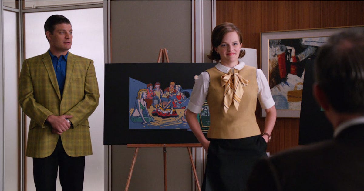
Being an advertising professional was the coolest job a person could possibly have back in this time.
But what exactly was an advertising agency in the 60s?
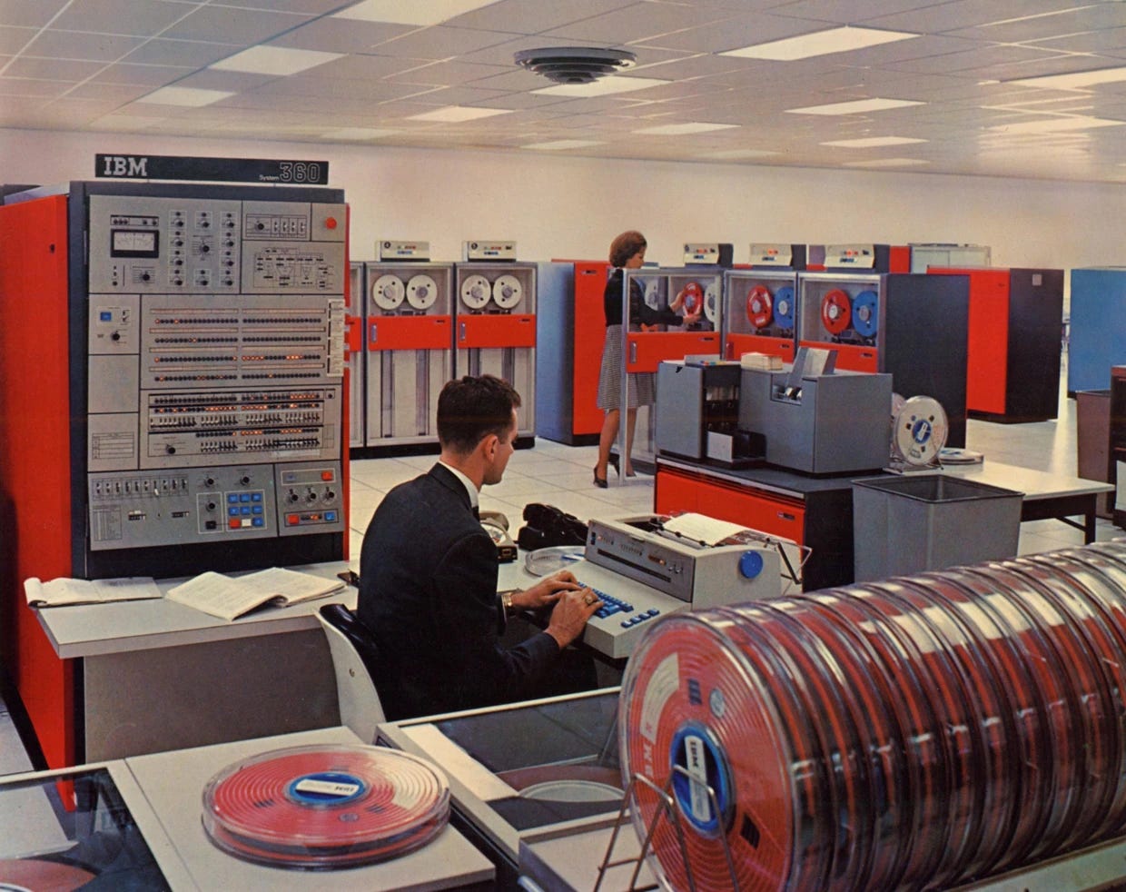
This is crucial for us to investigate because, at this time, a computer didn’t even have a screen and occupied a whole room. It was mostly used for data processing and to assist with media buying and planning processes.
There were other devices, but they were mostly typewriters and phones.
Graphic design, nevertheless, already existed! But it was done by hand.
Within a classical structure, there were many different departments within an agency:
Executive Leadership (Management): At the top of the agency hierarchy were the executives who provided strategic direction, made major decisions, and oversaw the overall operations of the agency. This included positions such as the CEO (Chief Executive Officer), President, and other top-level management.
Account Management (Sales): The account management department handled client relationships and served as the main point of contact between the agency and its clients. Account managers were responsible for understanding client needs, managing campaigns, and coordinating the work of various departments to ensure client satisfaction.
Creative Department (Design & Copywriting): The creative department comprised copywriters, art directors, graphic designers, and other creative professionals. They were responsible for developing advertising concepts, creating visual designs, writing compelling copy, and producing the actual advertising materials.
Media Department (Paid Advertising): The media department was responsible for media planning and buying. Media planners researched target audiences, selected appropriate media channels (such as TV, radio, print), negotiated media placements, and monitored campaign performance.
Research Department (Marketing): The research department conducted market research, gathered consumer insights, and provided data to inform advertising strategies. This included conducting surveys, analyzing market trends, and studying consumer behavior.
Production Department (Printing & Audiovisual): The production department handled the physical production of advertisements. This involved coordinating with suppliers, printers, photographers, and other production-related vendors to bring the creative concepts to life.
Support Functions (Secretariat & Administrative): Finance, human resources, and operations, provided necessary support services to ensure the smooth functioning of the agency.
Designing physical products, packaging, and ads was the main function of the creative department, so, if for some crazy reason, screens, software, and apps already existed back then, this means that designing a digital product would be a job for the creative department.
So essentially, UX/UI designers come from the same department that has always creatively manufactured products and ads to life.
The reason why I had to bring this up is that before recognizing that you are a UX/UI designer, you need to understand that you are inherently, a creative professional, and such a title is way bigger in dimension than what we have been talking about.
2.4 A Multidisciplinary Field Comes to Life
But in a quite confusing way.
I can’t tell for sure when was the first time that I heard about UX Design. But when checking some old emails I noticed that back in 2015, I already had the audacity of putting such a title in my email signature.
I remember that back then, I had already navigated through many different kinds of advertising challenges, making brands, restaurant menus, flyers, outdoors, a massive bunch of social media posts, stickers, business cards… perhaps the one thing I didn’t accomplish was the most unexpected demand that came from the founder of one of the agencies where I worked at. She wanted to cover the whole side of a 30-story building with a massive and ginormous banner promoting our biggest client back then, a company that sold wall paint. My first question was: “How could I possibly design a file that big? Do I divide the artwork into dozens of different pieces?” After frying many brain cells trying to solve that problem and after having my Photoshop and my Illustrator crashing over and over and over and over and over again, she gave up that idea and I could finally breathe again. (Leslie, if you ever read this, I still owe you that bold banner!)
Sometime later, my first-ever website demand arrived at my desk but there was no such thing as Figma, Sketch, or Adobe XD, so Photoshop was my weapon of choice. Chaos! Pure Chaos. The layers panel was impossible to read, there were at least ten different font sizes, the canvas proportion and resolution were probably wrong and the file had at least 5GBs of size.
Nevertheless, there was something special about the idea of designing buttons, and sections and doing the same type of information architecture that I used to do for print materials, but for a digital medium. I got so fascinated with that challenge that UX/UI became the subject of choice for my graduation thesis.
It was somewhat like web design but with a special touch. Don Norman was the true author that popularized the term through the book "The Design of Everyday Things" and there were very few authors talking about it, one of them being the Brazillian Fabricio Teixeira with this blog UX Collective.
Many different functions, methods, and practices were being attributed to UX Designers but it was quite hard to nail down a solid idea of what it really was. In fact, I tend to think it is hard and confusing up until this day.
Precisely because this field comes from a multidisciplinary nature.
The foundational objective of such a professional was mentioned above, it was the same goal shared by graphic designers and advertising professionals: To architect information, but not necessarily with the goal of selling something, but primarily with the goal of helping a human communicate with machines.
Don Norman taught me quite a clear direction: I had to emphasize the importance of considering the holistic experience of users when designing products.
But what in the name of cosmic aliens could a good experience possibly be?
As a user of a digital device, reading this article is an experience for you.
But if I use the wrong words,
Maybe you are gone.
If the Substack font size is not big enough,
You are gone.
If this article is too long, boring, and tiring to consume,
You are gone.
Many different and sometimes, even tiny details can make the necessary difference for you to truly enjoy your experience and say:
“Hey, that was interesting. I will be back later for more.”
Content-wise, it is just a matter of adding value while keeping you entertained by the theme.
But when it comes down to designing a website or software, then it increases in complexity by at least 10 folds.
It won’t be just about the information, it will be about the usability; accessibility; user flow; layout; alignment; typography; icons; images; visuals; buttons; colors; business strategy; front-end; psychology & human factors, and then it will be about research and data collection so that you maybe have to scrap 90% of the work based on the feedback of the actual users which is data and not intuition.
Pretend for a second that you need to design the app screens for a cool idea from a cool founder. It comes as an extremely objective briefing: “I want an app that makes it possible for the user to keep track of every single subscription that he pays for”
So now what do you do?
Well, you draft a placeholder logo, you think of a user persona, you put together a user flow with the necessary screens, you make wireframes, you design the interface, you write the content, and you think of new useful functions that could very well become the true value behind the product, you do some user research with friends, you take the picture that goes in the login screen and you prototype the screens with subtle animations.
How many functions did you execute? That of a founder by thinking about the business model and proposing new features? That of a copywriter by writing all the content? That of a photographer by taking pictures? That of a UX designer by researching and trying to make the experience as seamless and intuitive as possible? That of a UI designer by making everything look fresh and bold?
What? What are you? A one-man army?
Well, you are a multidisciplinary creative professional and maybe you don’t realize how important you are.
You know it, I know it.
Because at the end of the day, nothing can truly stand between us, and the next time we will hit the export button eager to show progress and experiments.
Listen, if you got up to this point, then you are a hero, your attention is as sharp as the accuracy of a sharpshooter. But users don’t have that patience nowadays, people’s attention span is as granular and urgent as a grain of sand that goes down the hourglass every single millisecond, if an error pops up, if the user gets stuck, or if the aesthetic is not cool and unique enough, then you may lose that user forever and you might never know why.
It sounds complex, scary, and massive. But it doesn’t need to be and I intend to prove that! Through this series, I will show you that UX/UI is not only an extremely fun and demanding profession, but it is also the most accessible place to start your career as a designer today.
Stick around cosmonaut.
In fact, I will share with you what is the secret skill that only a few UX designers hold.
A huge bag of references and inspirations.
Are you still thinking about the financial app the founder asked for?
Well, Bobby does just that in a very fun, elegant, and minimal way.
That is a fantastic UX/UI case right there.
Over and out!
About the Author
Thiago Patriota
Made in 1996. Born & Raised Brazillian. Bachelor’s Degree in Advertising and Communication. Adept to autodidactism. Photojournalist. Curious Soul. Author of Adeus, Aurora. Founder of Sentient.
That’s me in a nutshell but you can learn more about Agency and myself on the About page!


